US Stamps
Heightened powers of observation: stamp collectors see what others miss
We stamp collectors are an observant bunch.
After all, we spend a great deal of time closely scrutinizing small, colorful bits of paper.
We like looking at intricate lines of engraving under a magnifying glass.
We enjoy hunting for the location of microprinted words found on many stamps.
Our eyes immediately spot that tiny plate number at the bottom of a coil stamp that untrained eyes overlook.
A week or so ago, these thoughts were rolling across my mental movie screen while I was going through a stack of subscription-reply envelopes and other similar covers sent to Amos Media, the parent company of Linn’s Stamp News and the Scott catalogs.
After my colleagues in our advertising and circulation department extract the contents, the envelopes are set aside for me to search through. It’s a nice perk, and a great way to decompress after a busy day.
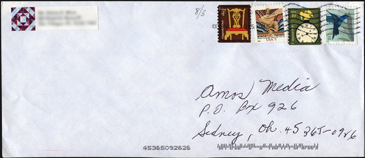
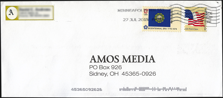
Herewith are two covers sifted from a recent search that immediately caught my stamp-collector’s eye.
Notice anything odd about the United States nondenominated (41¢) Flag coil on the first cover?
Look at the red stripes of the flag: They are shifted to the right about 4 millimeters.
What else is amiss here?
On a normal example of this stamp, the flag pole is to the left of the flag.
Here, it appears on the right.
This is due to a misregistration between the printed web (roll) of stamp paper and the flexible, metal mat used to apply the die cuts between the stamps.
Because of the freak shift of the red stripes, the pole appears to be attached to the right side of the flag.
Overall, these two snafus combined to yield a marvelous printing and production freak.
Did a stamp collector intentionally use a misprinted Flag coil on this envelope before mailing it?
An out-of-period use of the 1976 13¢ New Hampshire State Flag stamp to complete the overfranking of 54¢ (5¢ convenience overpayment) suggests the answer is yes.
No matter. I still think it’s a nifty cover.
As for the second cover, closer focus is required to see the standout feature.
Four stamps were used for the 49¢ first-class franking: 34¢ Hummingbird, 10¢ American clock coil, 4¢ Chippendale Chair coil, and a 1¢ Wisdom.
Wait a minute, says the astute collector: Something doesn’t seem right about the denomination of that Wisdom stamp.
That’s because the Wisdom stamp is actually denominated $1. But because the dollar sign (“$”) to the left of the “1” at the bottom of the design is so small, the sender mistakenly thought it was a 1¢ stamp.
I’ve written about such cases of mistaken identity in my Dollar-Sign Stamps column in Linn’s on a couple of occasions.
Do you have a stamp or cover that caught your eye because of some subtlety that others missed?
Tell me about it in the comments section below, or shoot an email (along with a picture of your treasure) to csnee@amosmedia.com.
MORE RELATED ARTICLES
Headlines
-
World Stamps
Oct 10, 2024, 12 PMRoyal Mail honors 60 years of the Who
-
US Stamps
Oct 9, 2024, 3 PMProspectus available for Pipex 2025
-
US Stamps
Oct 9, 2024, 2 PMGratitude for Denise McCarty’s 43-year career with Linn’s
-
US Stamps
Oct 9, 2024, 12 PMWorld’s first butterfly topical stamp in strong demand


