US Stamps
Changed colors from offset and gravure printing: U.S. Stamp Notes
By John M. Hotchner
It is often said that an expertizing certificate is an essential when considering purchase of a stamp (or postal stationery item) represented to be a missing color. In the last couple of weeks, Linn’s readers have provided some excellent examples of why this is so.
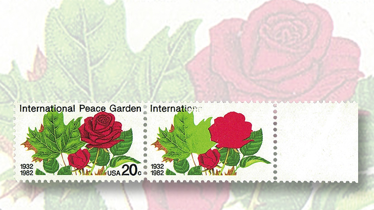
To qualify as a missing color, every bit of the color must be missing. Disappearing color, as with the intaglio black in the right-hand stamp in the 1982 20¢ International Peace Garden pair (Scott 2014) shown nearby, does not meet the standard. Nor does “almost completely missing” as illustrated by the 1988 36¢ Sikorsky airmail stamp pictured in the U.S. Stamp Notes expertization column in the Sept. 21, 2015, Linn’s.
Questions from readers raise another aspect of the missing color problem, one that is even more difficult for the collector and the expertizer to deal with.
Connect with Linn's Stamp News:
Like us on Facebook
Follow us on Twitter
Keep up with us on Instagram
If you look at the Sikorsky or the International Peace Garden stamps through a sufficiently powerful magnifier, you can tell if the color is present or if it isn’t.
But what about colors that are so different from the normal that it would appear that one of the colors that was used to make up the correct shade must be missing?
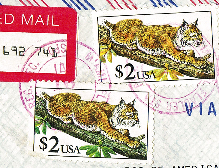
A prime example can be seen on the two 1990 $2 Bobcat stamps (Scott 2482) shown nearby, graphically cropped from their cover. Look especially at the branch upon which the bobcat is stretched out and the attached leaves.
On the bottom stamp, the normal example, the branch is dark gray-green and the leaves are green. On the top stamp, the branch and leaves are brown. The person who found the cover thought the top stamp might be the missing black listed in the Scott catalog.
There are two reasons why it isn’t. First, a careful reading of the catalog discloses that the missing black is the engraved black, not the lithographic black found in the branch and the bobcat. Secondly, what seems to be missing is the green coloring of the branch and leaves.
Here is where it gets complicated. The colors used to print the Bobcat stamp, besides the intaglio and lithographic black, were magenta, yellow, and cyan (blue). Each had its own plate, which printed the color as a dot pattern.
The human eye cannot see the dot pattern without a magnifier, but with one, preferably at 30x, you can see that the coloring of the branch and leaves are a combination of the magenta, yellow and cyan.
Any color of the rainbow (as seen by the human eye) can be produced in a stamp design by those dots laid on top of one another. Variables include how many dots to the square inch, how much ink is in each dot, and the pattern of dots used.
In the case of the brown branch on the top Bobcat stamp, the yellow and magenta are normal, but the blue-ink dots are light and partially missing. Without them, the intended gray-green and green elements of the design are flawed. This is not considered to be error even though the final design seems to be missing the desired green. Why? Because the blue ink is not totally missing. Again, this can be verified under 30x magnification.
It is certainly collectible, but Scott does not list such varieties. This is partially because for the sake of the size of the catalog the editors must limit the number of production flaws listed by restricting them to errors. In addition, though such unintended varieties can be seen by the human eye, they are not really significant.
In fact, most stamps printed using dot patterns (often by modern offset methods and by photogravure) have a range of normal. Look at a random group of Bobcat stamps, and you will see what I mean. While the Bobcat example we are discussing is beyond the normal range, it is still just a curiosity, not an error.
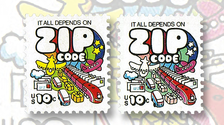
Another color variety example is the 1974 10¢ 1974 ZIP Code definitive (Scott 1511). The stamp was printed by the photogravure process on the Andreotti press. It is listed by Scott with yellow omitted (1511a), and a note in the catalog warns to beware of stamps with the yellow chemically removed.
Examples that seemed to be missing the yellow were submitted to the Bureau of Engraving and Printing in 1978, and in a letter dated May 9, 1978, the BEP gave the following opinion: “This issue of postage stamps was produced by a four-color rotogravure printing process. By this process, all colors are reproduced by printing the correct proportions of the three primary colors (yellow, magenta, and cyan) and black. Microscopic examinations of the submitted stamps showed the presence of a lighter-than-normal yellow impression on all five stamps. This light yellow impression also caused the green areas to appear more blue and the orange area to appear more red.
“A lighter-than-normal impression on a gravure printed stamp is usually caused by the washing of a printing cylinder while the press is running. Stamps printed during this washing operation are later removed from the web [and destroyed]. The yellow ink used in the production of this stamp is also susceptible to fading by exposure to strong ultraviolet radiation, and this may have the same effect on the colors on the stamp.”
Such explanatory letters from the Bureau are a great aid in understanding the workings of the presses. Unfortunately, the private printers that the United States Postal Service now uses generally don’t answer inquiries about varieties in their products, since to do so would add cost to the contract. But I would appeal to Linn’s readers who have been able to get answers, or who have BEP letters of explanation, to share them with me for possible use in future columns.
Contact me, John Hotchner, by snail mail at Box 1125, Falls Church, VA 22041-0125, or by email at jmhstamp@verizon.net.
MORE RELATED ARTICLES
Headlines
-
World Stamps
Oct 10, 2024, 12 PMRoyal Mail honors 60 years of the Who
-
US Stamps
Oct 9, 2024, 3 PMProspectus available for Pipex 2025
-
US Stamps
Oct 9, 2024, 2 PMGratitude for Denise McCarty’s 43-year career with Linn’s
-
US Stamps
Oct 9, 2024, 12 PMWorld’s first butterfly topical stamp in strong demand


