US Stamps
Keep an eye out for subtle color varieties on stamps
By John M. Hotchner
Color varieties on stamps can be fun, but they often require a sharp eye because the differences between normal and the unusual may not be obvious at first glance.
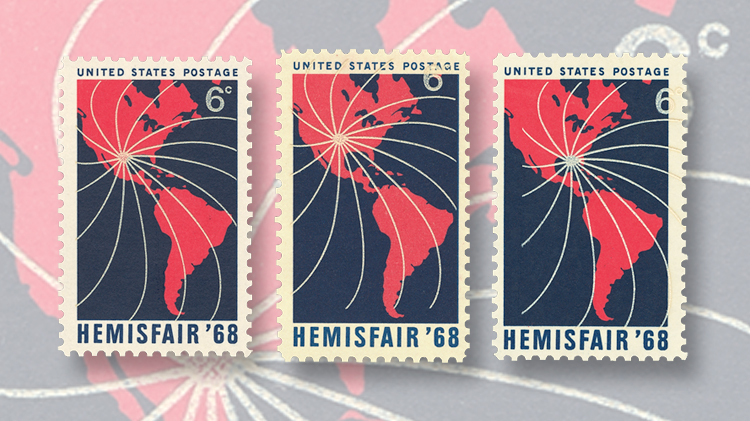
Shown nearby are three examples of the 6¢ stamp issued March 30, 1968, to commemorate the Hemisfair ’68 exhibition held that year in San Antonio, Texas (Scott 1340).
The theme of that fair, which celebrated San Antonio’s 250th anniversary, was “Confluence of Civilizations in the Americas.”
The stamp design features white engraved lines in a pinwheel pattern on a rose-red map of the Western Hemisphere.
On normal examples, the center of the pinwheel marks the location of Hemisfair in San Antonio.
In the nearby illustration, the stamp on the right is the normal example. On the stamp in the center the white engraving is shifted up, and it is shifted right on the stamp on the left.
While these are clear color misregistrations, they are easy to miss.
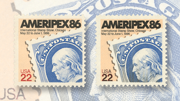
The United States Postal Service issued a 22¢ stamp May 25, 1985, to publicize Ameripex ’86, the international stamp show in 1986 in Chicago (Scott 2145). The stamp features a stamp-on-stamp design of the 1870 1¢ ultramarine Franklin stamp (134).
Can you spot the difference between the two Ameripex ’86 stamps shown nearby? Which one of the two is the normal stamp?
This stamp was printed on two separate sheet-fed presses. An offset press applied the background tan color and the gray perforation tips of the Franklin stamp. The text and the image of the ultramarine Franklin stamp were engraved on an I-8 intaglio press.
The text at the top promoting the show is supposed to be black with a red “USA 22” at the bottom.
All three intaglio colors were applied by the Giori method, which needed only one plate to do the job.
You can see the difference between the offset and the intaglio on the stamps shown nearby.
At left is a stamp with the intaglio colors entirely missing. At right is a stamp with the offset colors in their normal position, but the intaglio colors shifted to the left by 4 millimeters.
The intaglio plate was inked by three separate inking-in rollers, one for each color.
The ink troughs from which the three colors were drawn were positioned above each other. It could happen that an over-filled trough could drip globs of ink into the trough below, and thus contaminate the ink in that trough.
In the case of the black “USA 22,” it seems that black ink fell into the red ink and overwhelmed some of it. This did not happen often, but when it did, it usually did not affect all the stamps of a pane, but it could.
Another way in which color varieties could occur on Giori products was a mismatch between inking-in rollers so the wrong color ink is put on the plate in an unintended location.
A good example of this is the 20¢ Flag Over Supreme Court strip of three shown nearby.
The blue from the field of stars has moved into the red stripes, and the black from the flagpole area has moved into the stripes and field of stars.
While color varieties might not always be so obvious, they can serve as fascinating examples of how the presses work — or go off the trolley.
If you have an interest in the causes of production varieties, or simply enjoy having examples of interesting varieties for your album, the Errors, Freaks and Oddities Collectors’ Club would be delighted to have you as a member.
Its quarterly full-color journal, the EFO Collector, contains articles on production processes, new discoveries, types of EFOs, and a club auction.
For information, contact EFOCC Secretary Scott Shaulis, Box 549, Murrysville, PA 15668-0549, or by e-mail at scottshaulis@comcast.net. You can also learn more at the club’s website.
MORE RELATED ARTICLES
Headlines
-
World Stamps
Oct 10, 2024, 12 PMRoyal Mail honors 60 years of the Who
-
US Stamps
Oct 9, 2024, 3 PMProspectus available for Pipex 2025
-
US Stamps
Oct 9, 2024, 2 PMGratitude for Denise McCarty’s 43-year career with Linn’s
-
US Stamps
Oct 9, 2024, 12 PMWorld’s first butterfly topical stamp in strong demand


