US Stamps
If it’s too good to be true, it probably isn’t genuine
By John M. Hotchner
There is no shortage of interesting material out there to tempt collectors who are drawn to the unusual. However, much of this material is not what it is represented to be.
Fortunately for both beginners in the hobby and those who have some experience under their belt, there are expertizing houses that serve the philatelic community that can help you sort out the bad apples from the good.
The major philatelic expertising organizations in the United States are the Philatelic Foundation (PF, New York, N.Y.), the American Philatelic Expertizing Service (APEX, Bellefonte, Penn.), Professional Stamp Experts (PSE, Newport Beach, Calif.), and Philatelic Stamp Authentication and Grading Inc. (PSAG, Melbourne, Fla.).
Connect with Linn’s Stamp News:
Sign up for our newsletter
Like us on Facebook
Follow us on Twitter
Two items that illustrate the problem have recently crossed my desk. Both were represented as unlisted fabulous finds. It turns out that there are good reasons why they are unlisted — and unlistable.
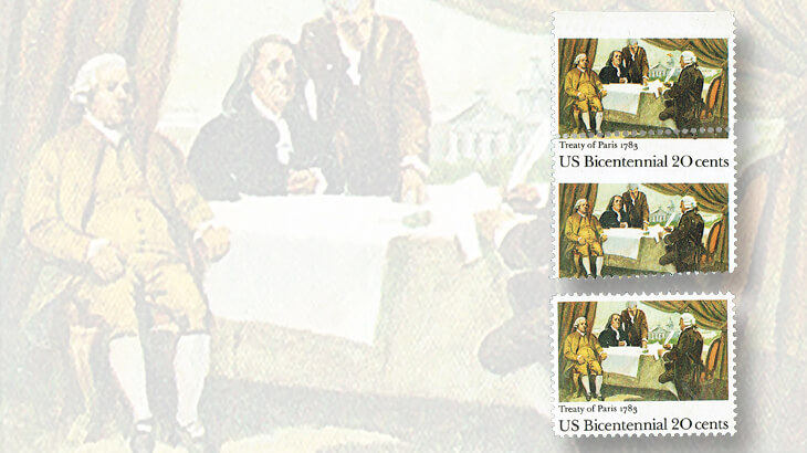
The more recent of the two items is a top margin pair of the 20¢ Treaty of Paris commemorative issued Sept. 2, 1983 (Scott 2052). The horizontal perforations are shifted up on a slight diagonal. This creates for the bottom stamp what is called a “design change misperf” because the text which should be below the illustration is now above the picture of the treaty signing. A normal stamp is shown for comparison.
But it is the top stamp in the pair that is more interesting. There is not a hint of the black descriptive text, and it would appear to be a black color-missing error, due to the misperforation. There was a time not so long ago when such an error would not have been listed. But Scott changed its policy starting with the 2003 Specialized Catalogue of United States Stamps and Covers and now lists misperf-caused missing colors.
Yet this error is not listed in the most recent, 2016 Scott U.S. Specialized. And here is why.
Unlike some other commemoratives of this era produced by combination presses that applied offset and intaglio colors to the same stamp, the Treaty of Paris stamp was printed on the seven-color Andreotti gravure press.
Only four color stations were used: yellow, magenta, cyan (blue), and black. All the black in this stamp — and there is some in the illustrated picture — was done from a single gravure black plate, meaning that the black color that has been cut off by the misperf did not affect the still-present black color in the illustration. Thus, this is not a color-missing error, though it might be represented as such by even honest dealers and collectors who don’t know precisely what they are dealing with, opting instead for what they wish it might be.
A trip to an expertizing service would soon get this item described correctly as “text removed by misperforation, but photogravure black present in the painting.” In other words, it is freak of moderate value; collectible, but not a big-bucks item.
10¢ Vertical Coil
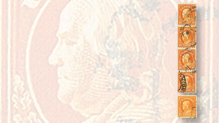
The second item is a vertical coil strip of four of the 10¢ Benjamin Franklin from the Third Bureau Issue of 1908-1922. You will look in the Scott catalog in vain for this stamp. There is a horizontal coil of the 10¢ Franklin (Scott 497), perforated vertically gauge 10.
The example shown is indeed perf 10, so it most likely began its life as the single-line watermarked perf 10 sheet stamp issued in 1914 (Scott 433). There was no imperf 10¢ Franklin from which this coil could be made.
Perforating at this time was an inexact science, and these stamps must have had wider than normal margins on one or both sides. It also is possible that one side was a straight edge from the center of a 400-subject sheet. These sheets were guillotined through the imperf central margin into four 100-subject panes for sale at post offices.
Unlike more modern stamps such as the 20¢ Treaty of Paris, where it is still possible to make new discoveries, the book is all but closed on stamps such as the 10¢ Franklin that are more than 100 years old. It is a safe bet that if it is not listed, it does not exist. If it existed and was issued as a normal mail-use stamp, enough examples would have been created and issued that we would know of it today.
So, the very fact that this is not listed makes it 99.9-percent certain that it is not genuine.
Now, to go a bit further. Linn’s readers have asked what logical process an expertizer actually goes through when reviewing a stamp or cover submitted for authentication, also called the patient.
The process varies with the patient being examined, but here is what an expertizer having a chance to review this strip would look at and look for as essential elements in making a determination on genuineness:
1. The presence or absence of a watermark. In this case, there is a clear single-line watermark. If this were a genuine issue, it would most likely be from the same era as Scott 497, the perf 10 horizontal coil, which is unwatermarked.
2. The opposing sides of a coil must be exactly parallel, and exactly the same size from top to bottom. Visually, the patient is much better than most fakes, especially so given that it is four stamps long. While it is true that whoever did these was a craftsman, the bottom stamp when carefully measured is a hair wider than the top stamp. In addition, at the very top of the top stamp, the edges flare outward just a smidgen.
3. The 10¢ that does exist as a horizontal coil is rotary printed. The image size for rotary printed vertical coils of the same era is 18.5 to 19 millimeters by 22.5mm. The image size for the stamps in the vertical strip is 18.25mm by 21.5mm. This matches up with the normal flat plate measurements that would be expected for Scott 433.
4. The stamp size from margin to margin on rotary press vertical coils is around 21.5mm. The side-to-side measurement for this strip is barely 20.5mm. While there can be some variation, a 1mm difference is not a good sign.
5. The colors of Scott 497 and 433 are both listed in the catalog as “orange yellow,” but working with these stamps as expertizers do, means that through experience, we know that Scott 497 is just a bit brighter and tends to a lemony yellow more than orange yellow. See the example of Scott 497 illustrated with the strip. The strip is more characteristic of the color seen on Scott 433.
Putting all this together, my opinion is that this is not genuine.
Of course, I could be wrong. Submitters are always free to come back with additional facts to disprove my opinion.
I invite you to comment, ask questions about expertizing or specific patients, and to discuss real-life expertizing situations you have encountered. Contact me, John Hotchner, at Box 1125, Falls Church, VA 22041-0125, or by email at jmhstamp@verizon.net.
Related Articles:
Expertizing something that doesn’t exist
Stamp expertizing: more than just identification
The word 'almost' does not appear on expertizing certificates
MORE RELATED ARTICLES
Headlines
-
US Stamps
Oct 7, 2024, 3 PMMcMurtrie dismissed as APS education director following Sept. 21 arrest
-
US Stamps
Oct 7, 2024, 12 PMVasiliauskas named president of Mystic Stamp Co.
-
US Stamps
Oct 6, 2024, 5 PMApgar souvenir card available
-
US Stamps
Oct 6, 2024, 4 PMFirst Continental Congress and U.N. stamps receive Scott catalog numbers


