US Stamps
Expertizing colors of the 30¢ Roosevelt Presidential series stamp
In the last expertizing column in Linn’s July 28 issue, largely devoted to how experts deal with the color problems posed by the 1851-57 3¢ Washington stamps, I promised in this installment to discuss modern-era color problems that challenge the experts.
I have chosen to focus on the 30¢ Theodore Roosevelt stamp (Scott 830) from the 1938-54 Presidential series.
The 2014 Scott Specialized Catalogue of United States Stamps and Covers lists this stamp in three varieties: Scott 830 deep ultramarine valued at $4 mint, 25¢ used; 830a blue at $15 mint with no value listed for used condition; and 830b deep blue valued at $240 mint and no value listed for used.
A value of $1,000 is also given for Scott 830b as a plate block.
In the course of a year, I probably see between five and 10 requests to certify a 30¢ Theodore Roosevelt stamp or block as deep blue, and most examples do not make the cut.
How does an expertizer reach a conclusion regarding this stamp?
There are several components to the answer: comparison with previously expertized examples; knowledge of the physical properties of the variety and from that, knowledge of what can exist; knowledge of what earlier experts concluded; information that has been provided by the printer, in this case the Bureau of Engraving and Printing; and excellent light in which to make the comparison.
I will look at each of these components with the exception of lighting, which I have talked about in previous columns.
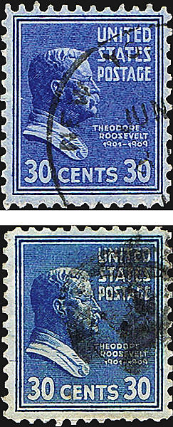
It is essential for the expert to invest in comparison examples of these stamps. As you can probably see from the illustration at the top of this page, the blue and deep blue varieties are fairly close in color. Yet to the trained eye, assisted by comparison examples, they are different.
Without comparison examples, it is easy to mistake a blue variety for a deep blue, and even stamps with a tinge of the ultramarine for blue. Single mint stamps for comparison are good. Blocks are better.
Knowledge about the physical properties of stamps and varieties comes from philatelic literature. In the case of the 30¢ Theodore Roosevelt stamp, The Prexies by Roland Rustad, is the best summary of current knowledge. It was published in 1994 by the Bureau Issues Association, now called the United States Stamp Society.
Rustad listed seven shades for this stamp: dark ultramarine, dark blue-ultramarine, blackish ultramarine, deep blue (reddish), blue-bright blue (reddish), bluish ultramarine, and bright ultramarine.
And then he adds insult to injury with this statement: “It is possible to find shades that are between the listed categories.”
Rustad does not identify the plates from which the deep blue varieties were printed, but the great majority seem to have come from early plates 22164 and 22165.
I understand that Wallace Cleland also had examples from plates 22833, 22834, 23116 and 23906, but of these, I have seen only examples from 22833 and 23906.
Also, I have seen many stamps from plates 22833, 22834, 23116 and 23906 that were not deep blue. The bottom line is that most of the genuine deep blues are from plates 22164 and 22165.
Rustad does note, “It is a characteristic of these shades [the blues] that the ink seems to ‘bleed’ through the paper (the stamp design is easily seen from the back), and the bluer the stamp, the more bleed through.”
I can confirm that from what I have seen, and the phenomenon is illustrated here.
As for the knowledge that earlier experts have concluded, I have two typewritten pages from George Brett, the dean of U.S. stamp expertizers for material produced by the BEP.
On one of these pages, Brett urges that expertizers “compare the part of a stamp that gives the best approximation to a solid print — in this case the back of Roosevelt’s head.”
On the other, Brett talks about four stamps submitted for expertizing that he reviewed at the same time. He poses the question that plagues the expertizer: When you have several different examples and all are different shades, and given the range of shades noted in Rustad, “Where do you draw the line on a shade?
He does not claim infallibility, and rendered his opinions case by case, according to what he perceived. That is all we can do.
In 1992, Rustad asked the BEP about two stamps that he provided and which are shown here.
In a long response, the BEP agreed that the stamps were different:
“As examined microscopically, the two stamps are printed on different papers, and the ink thickness of the printed image is different. The reddish [ultramarine] postage stamp image appears to have been printed on paper which is less porous than that upon which the blue image has been printed. The ink thickness appears to be greater on the stamp which appears bluer. On the bluer appearing postage stamp, there is evidence of considerable feathering, i.e., spreading of ink between printed lines.”
The BEP also said, “As analyzed by X-Ray fluorescence spectrometry, the ink on the two stamps is composed of pigments and extenders of the same inorganic chemical elements.” What then is the difference?
The BEP concluded, “In our opinion the bluer appearing stamp was not a result of using a substitute material for the blue color but was an example of the effects of a variation in raw materials.”
The bottom line is this is a case where there are definite guidelines, but no objective standard except in the eye of the beholder.
So it should not come as a surprise that experts sometimes do not agree, and debate ensues until a decision can be reached.
In my view, the deep blue variety is distinctive, but many stamps approach this shade without reaching the mark.
Unfortunately, almost all 30¢ Theodore Roosevelt stamps are submitted as being the hoped-for deep blue, so there are many disappointed submitters.
To put this in context, the Presidential series lasted for about 20 years. In that period, virtually all the single color Prexies show a wide range of shades, usually from warm darkish colors to lighter, crisper prints.
Several of these varieties even receive minor listings in the Scott U.S. specialized catalog, but no others get a letter-listing like the 30¢ does, and none show the kind of price disparity between routine and variety that the 30¢ does.
For that reason I have never seen another single- color Prexie stamp submitted for authentication as a cataloged variety.
Your expertizing questions welcome
The bread and butter of this column are your questions and experiences with expertizing. If you would like to pose a question or have puzzling experiences in need of some enlightenment, please contact me by e-mail at jmhstamp@verizon.net, or by mail at Box 1125, Falls Church, VA 22041.
Cartoon winner
No doubt there is much justified angst in the stamp collecting community over self-adhesive stamps that won’t soak. Several entries in the July cartoon caption contest emphasized this problem.
The contest featured the Coal Miner forever stamp from the 2013 Made in America stamp issue. Note the miner is working his pickax.
Scott Murphy of Newport Beach, Calif., represents those upset collectors with this line: “I used to be able to just soak the stamps off envelopes for my collection.”
Many also used the search for the upright $2 Jenny Invert as their theme. Glen Anderson from St. Paul, Minn., dreams in this vein with, “If I keep pounding away I just might find that upright Jenny!”
Two other themes received multiple entries. First is the story our parents or teachers told us about digging until we reached China. The other is riffs on the country and western song Coal Miner’s Daughter. Steve Kotler of San Francisco, Calif., turned this around to “It’s about time Loretta made the story of my life: Coal Miner’s Daughter’s Father!”
There were many excellent entries, especially those with philatelic lines. The winning entry, shown in the bubble on page 6 was sent by Emmanuel Atsalinos of Silver Spring, Md. What collector wouldn’t relish that opportunity.
On the nonphilatelic side, the winner is Brian Smith of Muncie, Ind., with “Forever is how long it’s going to take me to get clean!”
Both winners will receive Linn’s Stamp Identifier published by Amos Media, or a 13-week subscription to Linn’s (a new subscription or an extension). The book has a retail value of $12.99. Here are a few of the runners-up:
“I’m thrilled to be on a stamp, even if it’s just a miner variety” from Gary Kufchak of Wadsworth, Ohio.
“Politics is indeed a dirty business!” by Edgar Dunlap of Gainesville, Ga.
“They told me I might find some Dennison hinges in here,” sent by Aubrey Dunne of La Mesa, Calif.
“This is a good place to hide my newly acquired British Guiana Penny Magenta!” from Tim Ryan of San Francisco, Calif.
“Two more tons and I can buy an imperf Express Mail press sheet!” by William David Webb of Jenkintown, Pa.
“I’m between a rock and a hard place,” sent by Gilbert Schaye of New York, N.Y.
“Humbug! The realtor said this house had a dry basement!” by Charles Wales of Ashburn, Va.
“I found the light at the end of the tunnel — it’s me!” sent by Thomas and Laura Tomaszek of Cedar Rapids, Iowa.
Thanks and a tip of the hat to all who entered.
The next cartoon caption contest will be announced in the Sept. 8 Linn’s.
MORE RELATED ARTICLES
Headlines
-
US Stamps
Oct 7, 2024, 12 PMVasiliauskas named president of Mystic Stamp Co.
-
US Stamps
Oct 6, 2024, 5 PMApgar souvenir card available
-
US Stamps
Oct 6, 2024, 4 PMFirst Continental Congress and U.N. stamps receive Scott catalog numbers
-
World Stamps
Oct 5, 2024, 1 PMCanada Post continues Truth and Reconciliation series


