World Stamps
The two events that inspired Royal Mail’s gold Machin stamps
By Larry Rosenblum
Gold is an unusual color for a stamp, but Great Britain’s Royal Mail used it twice for its Queen Elizabeth II Machin definitive stamps to celebrate two golden occasions.
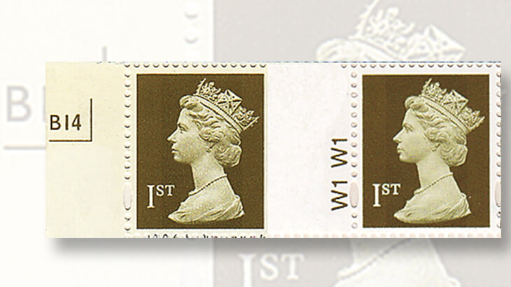
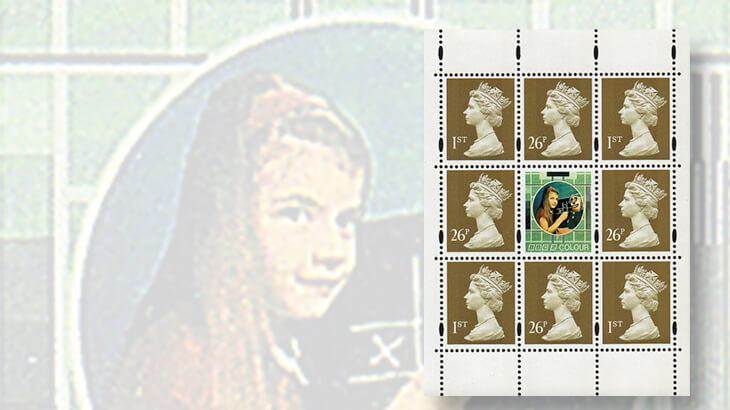
In 1997, the Machins used for first-class mail were issued in a gold color to celebrate the golden wedding anniversary of the queen and Prince Philip.
The first-class rate at the time was 26 pence, so both denominated and nondenominated first-class stamps were issued in gold from April to November.
Connect with Linn’s Stamp News:
Sign up for our newsletter
Like us on Facebook
Follow us on Twitter
After that, the 26p and first-class Machin stamps returned to their previous flame color.
Gold stamps were reintroduced in 2002 as part of the celebrations of the golden jubilee (50th anniversary) of the queen’s accession to the throne. By this time, Royal Mail no longer issued denominated stamps for first-class mail, so only the nondenominated first-class stamp was issued in gold.
Royal Mail then decided that the gold color would remain in use because “gold conveyed the idea of excellence.”
The gold Machins were replaced 10 years later with diamond blue stamps to honor the queen’s diamond jubilee.
First-class stamps are widely used in Great Britain, so even though the 1997 stamps were in use for only eight months, two printers produced them in two formats.
The first gold stamps were issued on the queen’s birthday, April 21, 1997.
Harrison and Sons, which had recently been purchased by De La Rue, printed the 26p in sheets and the nondenominated first-class stamps in booklets of 10. Walsall Security Printers printed the first-class stamps in sheets and booklets of 10.
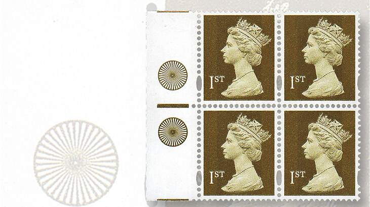
Although both printers produced the gold stamps using gravure, Harrison and Sons was able to achieve the desired result with a single color cylinder. Walsall required two similar colors to get the right shade and appearance.
Booklets from both printers shown nearby display the cylinders used.
The difference between the two Walsall cylinders is more easily seen in the “color wheel” markings in the selvage of the first-class sheet stamps.
By the time gold stamps returned in June 2002, Royal Mail had converted all its booklets to self-adhesive stamps. The House of Questa, which had also been purchased by De La Rue, produced booklets of six, and Walsall produced booklets of six and 12. Joh. Enschede of the Netherlands printed self-adhesive business sheets of 100 and water-activated vertical coils.
Gold sheet stamps were not issued until June 2003. These were printed by De La Rue with water-activated gum.
In 2006, Royal Mail instituted a new set of postal rates for domestic mail called “Pricing in Proportion.”
The cost to mail an item would now take into account its size as well as weight. This led to the introduction of a class of mail called “large letters.” Any envelope exceeding about 10 inches in length, 7 inches in width, one-fifth inch thick, or 3.5 ounces in weight would require more postage.
At the time of introduction, a first-class standard letter cost 32p, and a large letter cost 44p.
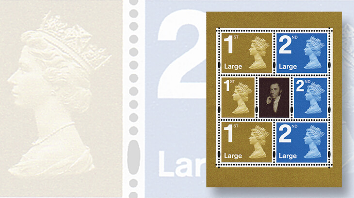
To pay for this new large-letter rate, Royal Mail decided on a larger stamp (in horizontal format) with a larger service indicator (“1st”) at the upper left and the word “Large” at lower left. The Machin head was slightly reduced in size.
In order to be consistent, Royal Mail modified the regular Machin stamp, now used for standard letters, to include a large service indicator as well.
That change to the smaller stamp created a problem. Customers thought the large numeral meant that the stamp would pay for large letters.
Less than a year later, the smaller stamp with the large numeral was discontinued and replaced with the original Machin design. The stamp for large letters remained, and that format is still in use today.
Another big change came in 2009, by which time almost all definitive stamps were produced as self-adhesives. Royal Mail added several new security features.
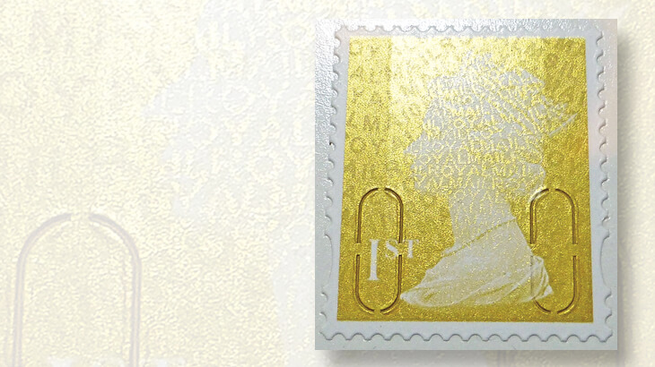
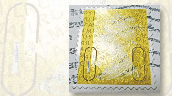
The photograph nearby, taken at an angle, shows the four notched, U-shaped slits that make the stamps difficult to remove from the envelope after they have passed through the mail.
Also visible is the iridescent overprint that consists of wavy lines of the text ‘ROYAL MAIL.’ The pattern is different over the queen’s head. Most stamps have two codes in the overprint: a single letter indicating the source of the stamp and two digits to indicate the year the stamp was printed.
In the image shown nearby, you might be able to see the letter “S” in the upper right, signifying that the stamp came from a booklet of six, and the two digits “10” to the left of the queen’s forehead. This overprint was intended to be difficult to reproduce.
The gold Machin has the dubious distinction of being the first Machin to be widely counterfeited. This was probably just bad timing — printing and processing technology had advanced enough so that it was easy to create reasonable facsimiles. Some counterfeits are easy to spot, but others are quite good.
In the image slider above is a photograph of a counterfeit gold Machin that successfully passed through the mail. The elliptical perforations, U-shaped slits and the iridescent overprint are all very realistic. The only characteristic that fakers cannot imitate is the phosphorescent afterglow of the two vertical bands at the sides of the stamp.
Chemicals that create an afterglow are carefully controlled, so counterfeiters simulate the bands with a varnish, but there is no phosphorescent reaction. This provides an easy method for collectors to identify these counterfeits.
The gold Machins went through several changes during their 10-year second life, making them an interesting part of this ever-evolving series.
MORE RELATED ARTICLES
Headlines
-
US Stamps
Oct 7, 2024, 3 PMMcMurtrie dismissed as APS education director following Sept. 21 arrest
-
US Stamps
Oct 7, 2024, 12 PMVasiliauskas named president of Mystic Stamp Co.
-
US Stamps
Oct 6, 2024, 5 PMApgar souvenir card available
-
US Stamps
Oct 6, 2024, 4 PMFirst Continental Congress and U.N. stamps receive Scott catalog numbers
