World Stamps
Three failures lead to the long-lived Sower design
By Larry Rosenblum
As the 20th century approached, Paris was preparing to host a world’s fair in 1900. Responding to public demand, French postal authorities decided to replace the long-running Sage series that featured allegories of Peace and Commerce. A committee selected three designs by French artists, one each for low, middle, and high values. All of the stamps were printed by typography.
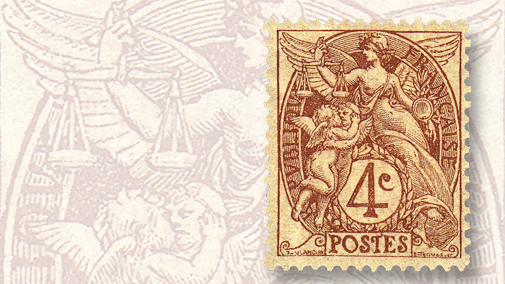
The design for the low values was created by Paul Joseph Blanc and engraved by Emil Thomas on wood. Originally there were five values, from 1 centime to 5c (Scott 109-113), for mailing printed matter.
The Blanc design features a voluptuous winged young woman representing France. She is holding the Scales of Justice and leans on the circular value tablet that is surrounded by a laurel wreath. In front of her on her right are two playful winged cherubs.
Connect with Linn’s Stamp News:
Like us on Facebook
Follow us on Twitter
Keep up with us on Instagram
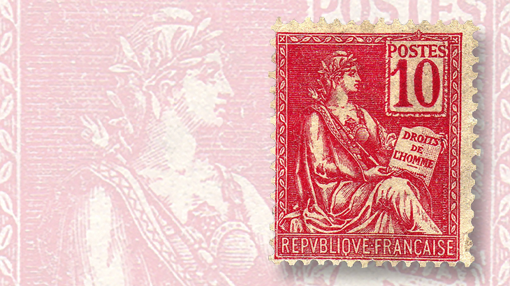
The middle values were designed and engraved on steel by Louis-Eugene Mouchon. The original five values ranged from 10c to 30c (Scott 116-120) and were primarily for mailing letters.
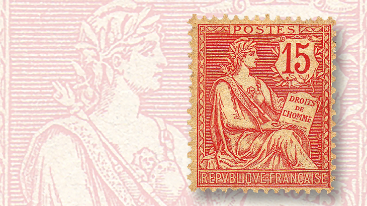
Mouchon’s stamp shows a seated woman in Roman attire with a wreath around her head. She is holding a scepter in her right hand and the French Bill of Rights (Droits de l’Homme — literally “Rights of Man”) on her lap. The value is in a square tablet at the upper right.
These middle values are sometimes called The Rights of Man, or Sitting Goddess, but they are often simply referred to as the Mouchon series.
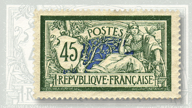
The high values were double-size horizontal stamps in two colors designed by Luc-Olivier Merson, a well-known painter, and engraved by August Thevenin on wood. The original five values spanned 40c to 5 francs (Scott 121, 123, 125-126, 130) and were for services such as registration.
On the right of Merson’s design sits a peaceful, pensive woman with her head resting on her right hand and the handle of a sword, which rests on her lap, in her left. The weapon indicates she is ready to fight to defend herself. The upper part of a bag on her lap is also visible.
On the left is a palette with the value. Behind it is an olive tree extending upward towards the left, its branches and leaves filling the center of the design and circling the value. The background in the center of the stamp and just below the value is filled with the second color, though other parts of the background remain white.
These stamps are known as Liberty and Peace, or simply the Merson series.
The woman who represents France on all these stamps is Marianne, a symbol of the French republic similar to Britannia in the United Kingdom and Lady Liberty in the United States. Marianne first made her appearance during the French Revolution.
Marianne is always shown wearing a Phrygian cap, a specific type of liberty cap. The use of a cap to signify freedom dates from Roman times, when soft felt caps were used to identify freed slaves. The liberty cap became a symbol of the American Revolution and was adopted by the French Revolution.
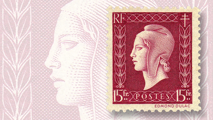
The Phrygian cap has the top pulled forward, a style associated with several ancient people including those who lived in Phrygia, located in what is now Turkey. The cap can be seen more clearly in later French stamps that feature a close-up portrait of Marianne.
None of France’s three turn-of-the-century designs was popular. The Merson design was the subject of jokes and caricatures. The engraving was not done well, and the second color was not chosen or used wisely. The Mouchon design was also subjected to criticism and sarcasm. A label sold in Paris parodied the design using a standing woman holding a banner proclaiming “Rights of Woman” (Droits de la Femme). This was a time when women were campaigning for rights such as suffrage.
The Mouchon design was redrawn in 1902. The image was made clearer. The value was put in a shield decorated with olive branches and the word “Postes” was moved out into a frame at the top. This wasn’t enough to save it, since much of the criticism related to the inscription on the Bill of Rights, not the overall design or its implementation.
Even as the Mouchon design was revised, plans were being made for a simple but attractive design to replace it. In October, 1902, the design known as the Sower (La Semeuse) was selected. This design, by Louis Oscar Roty, was first introduced on a medal for the Department of Agriculture in 1887 and was used on coins starting in 1897. Mouchon engraved the stamp design.
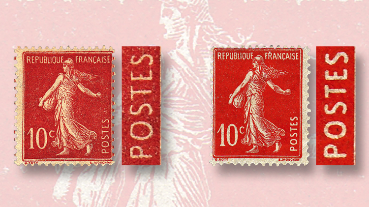
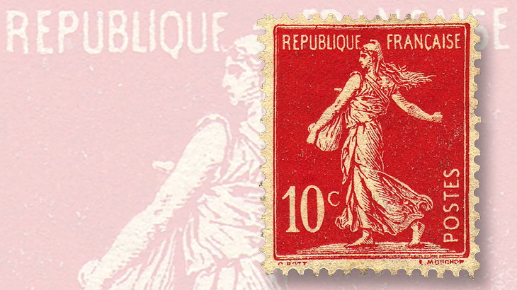
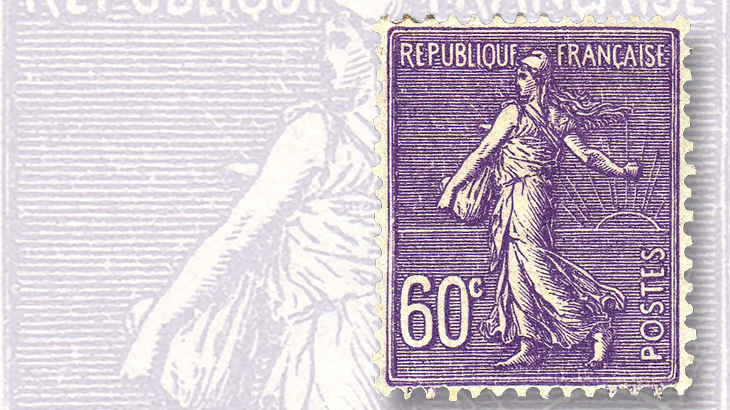
The Sower is Marianne in robes and Phrygian cap engaged in the peaceful activity of sowing seed. She carries a full bag of seeds under her left arm and is scattering the seed with her extended right arm. The neck of the bag is visible above her left elbow. Her hair is flowing behind her.
In the first version of this design (Scott 138-142), which appeared in 1903 to replace the five values of the Mouchon design, the sun is shown rising over the horizon and the background consists of horizontal lines.
This design was also criticized. The horizontal lines made the lettering hard to see. Judging from her hair fluttering behind her, Marianne is tossing the seed into the wind, though some people maintained that this was intentional, the hair and right arm at the upper right providing balance for the large numerals at lower left. Finally, Marianne was considered too thin for then-current French taste.
Postal authorities asked Mouchon to revise the design, and he devised a version with a solid background and Marianne walking on a mound of earth (Scott 155). Only the 10c value was issued in 1906 before a new government took office and revised the design further.
The new postal authorities gave Marianne a little extra weight and removed the earth and the protruding top of her bag. The 10c and 35c values in this final design (Scott 162b, 175b) were issued in 1906.
It was quickly determined, however, that the lettering was too thin. Thicker letters were used later in 1906 on a revised 10c value (Scott 162) and four other values. All subsequent values of this Sower design were issued with thick letters. The thin-lettered 35c was finally replaced in 1926 (Scott 175).
The original Sower design was revived in 1921, and 12 values were issued during the 1920s (Scott 143-154). The solid background version remained in use as well.
It had taken six years, but finally a satisfactory design was found. Eventually, nearly all of the Blanc, Mouchon and Merson designs were replaced by the Sower, which was used until 1939.
MORE RELATED ARTICLES
Headlines
-
US Stamps
Oct 7, 2024, 3 PMMcMurtrie dismissed as APS education director following Sept. 21 arrest
-
US Stamps
Oct 7, 2024, 12 PMVasiliauskas named president of Mystic Stamp Co.
-
US Stamps
Oct 6, 2024, 5 PMApgar souvenir card available
-
US Stamps
Oct 6, 2024, 4 PMFirst Continental Congress and U.N. stamps receive Scott catalog numbers
