US Stamps
The expertizer’s mind-set: skepticism and review
U.S. Stamp Notes — By John M. Hotchner
“I’m from Missouri” is a good approach to expertizing. Missouri’s unofficial nickname is “The Show-Me State” because its citizens are reputed to be skeptics. Experts take nothing on faith, and can’t afford the luxury of snap judgment or even educated assumption.
The reason is that others are going to be making financial decisions based on your opinion, and the hobby itself may be expanded or diminished because of your conclusions about stamp or cover (the patient) being examined.
Connect with Linn’s Stamp News:
Sign up for our newsletter
Like us on Facebook
Follow us on Twitter
For these reasons, most experts I have talked with start from the position that an item that they have been asked to examine can be faked, and before they can say it hasn’t been faked, it must be subjected to review using every bit of knowledge they have, plus whatever information and tools they have available.
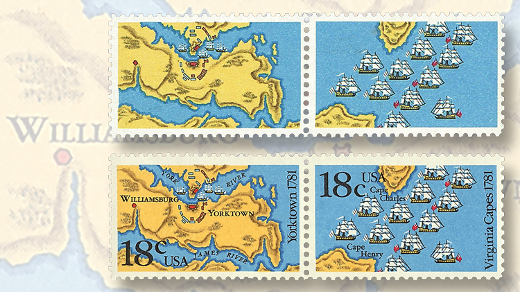
Let’s take, for example, a purported color-omitted error of the 1981 18¢ Battle of Yorktown/Battle of the Virginia Capes se-tenant pair (Scott 1938a).
In the illustration, the pair submitted for expertizing is shown at top, and a normal pair is at bottom. How can an expertizer reach a valid conclusion as to whether the top pair is a genuine error, an almost error, or an alteration masquerading as an error?
What’s “an almost error”? That would be a stamp that is genuine, looks like an error, but has evidence that what appears to be missing is actually present.
For a missing color, it might be dots of color where they are supposed to be, but they are too few and too small to be seen by the eye unaided. A 10-power magnifier might suffice for inspecting the stamp, but a 30x magnifier is better.
The first thing the expertizer will want to do is to check the Scott Specialized Catalogue of United States Stamps and Covers and the Scott Catalogue of Errors on U.S. Postage Stamps by Stephen R. Datz to see if there is a known error to match. It is not fatal if there isn’t, but it is a strike against the patient. There also may be a catalog note warning that printer’s waste exists, or a note that provides other useful information.
In the case of Scott 1938a, the Scott U.S. Specialized catalog lists two missing-color errors: “black (engr., inscriptions) omitted” (1938b) and “black ‘litho’ omitted” (1938d). There are no additional notes. Datz expands on the catalog listing and also depicts both of these missing-color errors. The patient resembles 1938b with the omitted black inscriptions.
Next, it is important to compare the patient to a known genuine example of the stamp or stamps. By doing this, the expert can compare the white around the margin and other white areas in the stamp design with the normal. Often, an altered stamp will show the white areas to have been affected by the agent that changed or faded out the purported missing color, be it sunlight or a chemical. Our patient passes this test.
The next side-by-side comparison is to look at the areas where the missing color should be. Here we use the aforementioned 30x magnifier to verify that all the black color is indeed missing. The normal pair shows us where to look. The patient does not pass this test; there are dots of black color in the area of the “18c usa” on both stamps.
To qualify as an error, the color omitted must be 100 percent omitted. So, this pair will get a certificate stating, “United States, Scott No. 1938a with just traces of black on both stamps, unused, full original gum, never hinged, genuine in all respects.”
In other words, this is one of those “almost errors.” It is totally genuine, but not the error.
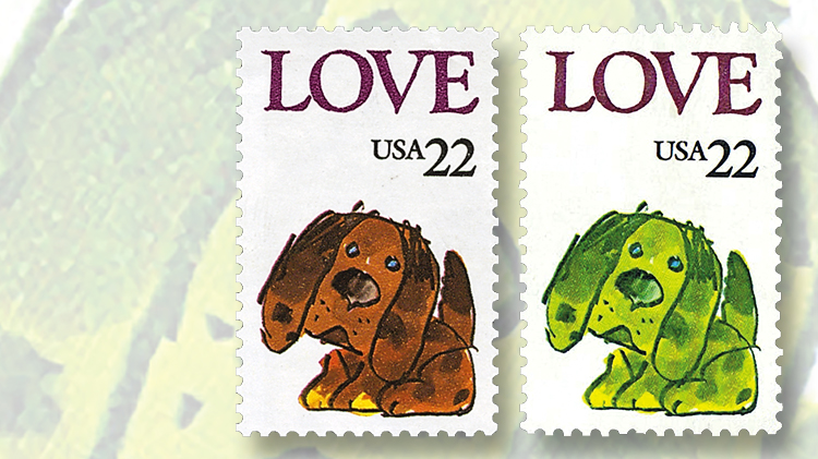
The second example is a 22¢ Love stamp of 1986 (Scott 2202) that was submitted as “missing brown.” The first problem is that there is no catalog listing for any missing color on this stamp. While it is not impossible for a new error to be discovered, the further away from date of issue that we get, the less likely that is to happen.
The second problem requires that expertizers know about different printing techniques, and the properties of each on issued stamps. This stamp was printed by photogravure, a process by which dots of up to five colors are laid on top of one another to achieve the desired colors. In this case, the puppy featured in the design is made up of a combination of yellow, blue (cyan), red (magenta), and black — all easy to see with our trusty 30x magnifier.
Yellow, blue, and black add up to the green puppy. What makes the puppy brown is the addition of red dots of color. And that is what is missing, not brown as the owner surmised.
So, could this be a genuine error? To determine that, the next thing to do is to compare the white parts of the design and then the colored parts of design.
Those comparisons need to be done in a well-lit room, or outside in natural light. The practiced eye will soon determine that in this case, the white areas of the stamp are flatter and slightly darker than on the original. In addition, the word “LOVE” is dull on the claimed error, but brighter on the genuine example. These findings lead the expertizer to the inexorable conclusion that this stamp has been altered.
To go one step further, both stamps need to be examined visually under shortwave and longwave ultraviolet light to see if there has been any alteration of the tagging. In this case, the altered stamp is less bright under longwave UV light. If colors (usually yellow, orange, or red) have been bleached out by light, the alteration to tagging will be minimal, as with this 22¢ Love stamp. If the colors have been altered by chemicals, the tagging is typically greatly disturbed.
So, my conclusion is that this Love stamp was altered by prolonged application of direct light, and it is not a genuine error.
Another property of photogravure printing is that the application of colored dots may vary in intensity throughout the production process, leading to minor differences in the colors of the final product.
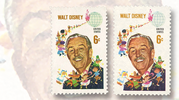
Look at the two 1968 6¢ Walt Disney stamps (Scott 1355) shown in the third illustration. Both are genuine in all respects, but the face of Walt Disney is quite a bit darker on the stamp on the right.
Five colors were used to print this stamp: yellow, red, blue, black, and tan. Disney’s face is made up mostly of yellow and tan. If you look at the darker face under 30x magnification, you will see it has a lot more tan coloring. This has led some to think that the lighter-face stamps are missing a color. Their supposition can be encouraged by the fact that there are three color-omitted errors listed for the Walt Disney stamp: ocher (tan) omitted, black omitted, and blue omitted.
But a look under 30x magnification tells us that every color is present, just in different intensities from one stamp to the other.
Thus, this is not an error, but an example of the fact that there is a range of normal in the colors for a great many stamps printed by photogravure.
In future columns, I will discuss how an expert looks at some of the other problems that patients present. But for this time, I hope that the explanations about these three patients give you a sense of the complexity that can be encountered.
MORE RELATED ARTICLES
Headlines
-
US Stamps
Oct 7, 2024, 3 PMMcMurtrie dismissed as APS education director following Sept. 21 arrest
-
US Stamps
Oct 7, 2024, 12 PMVasiliauskas named president of Mystic Stamp Co.
-
US Stamps
Oct 6, 2024, 5 PMApgar souvenir card available
-
US Stamps
Oct 6, 2024, 4 PMFirst Continental Congress and U.N. stamps receive Scott catalog numbers


