World Stamps
How Britain’s regional stamps have changed over the years
By Larry Rosenblum
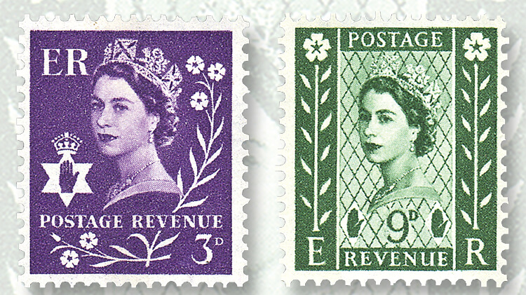
In response to public demand, in 1958, the British Post Office issued stamps to be used in the major regions — or countries as they are called locally — of Great Britain, with the exception of England.
Stamps were issued for Northern Ireland, Scotland, Wales and the Isle of Man, an island in the Irish Sea off the northwest coast of England.
The stamps had the then-current Wilding portrait of Queen Elizabeth II along with designs and symbols representative of the region.
Connect with Linn’s Stamp News:
Sign up for our newsletter
Like us on Facebook
Follow us on Twitter
These stamps were sold only in the individual region, but were valid for use throughout Great Britain.
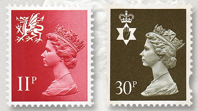
The Wilding design was used until decimalization in 1971, when it was replaced with a simplified design using the Machin head and a single symbol in the upper left corner. The Machin design lasted 30 years, though the Isle of Man became postally independent in 1973 and began issuing its own stamps.
 The two events that inspired Royal Mail’s gold Machin stamps: Gold is an unusual color for a stamp, but Royal Mail used it twice to celebrate two golden occasions.
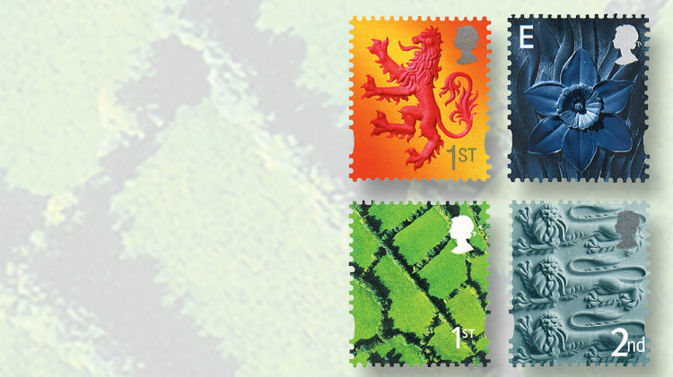
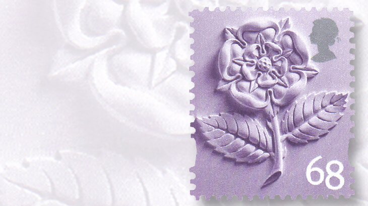
In celebration of the decentralization, or devolution, of power from the United Kingdom Parliament to regional legislative bodies, new pictorial regional stamps were issued for Scotland and Wales in 1999. In 2001, stamps followed for Northern Ireland and, for the first time, England.
There were four designs for each region, each paying a specific rate. All 16 designs remain in use today.
Initially, there were non-denominated stamps paying the rate for first- and second-class domestic letters and the basic letter rate to Europe. The European-rate stamp bears the indicator ”E.”
The fourth stamp was denominated and paid the second weight step for letters to the rest of the world.
In 2004, the “E” nondenominated stamps were discontinued and replaced with denominated ones, giving each region two nondenominated and two denominated stamps.
As with other long-lived stamp designs, there have been many changes along the way that collectors should be aware of. Not all of them are reflected in the various stamp catalogs.
Surprisingly for a set of British definitive stamps, the designs are very diverse. They run from a multicolored overhead photograph of patchwork fields in Northern Ireland to monochrome images of sculptures such as the three English lions.
Even more unusual than the range of designs are the differences in the common elements: the cameo queen’s head and the denomination or service indicator.
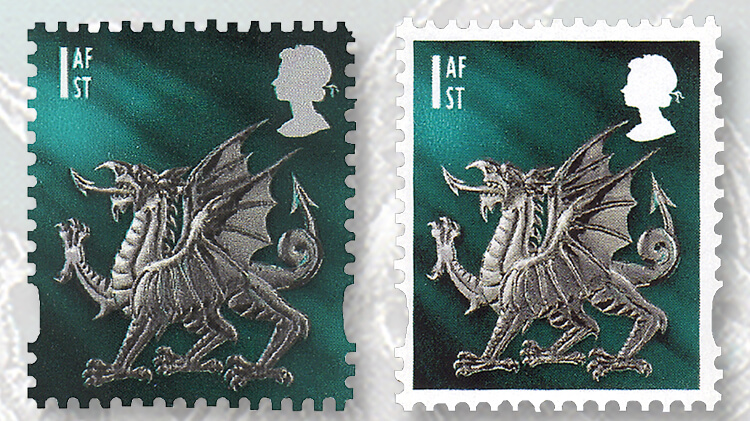
The queen’s head is always in its traditional location at the upper right, but on the initial issues it was printed in metallic silver on English, Scottish and Welsh stamps but was reversed out in white for Northern Ireland.
The value tablet is at the lower right for all stamps except the Welsh ones, where it is at the upper left. It is white for England and Northern Ireland and silver for Scotland and Wales.
The fonts are all different: a sans serif font on the Welsh stamp and various serif fonts on the others. The letters for the first-class and second-class indicators are uppercase for all regions except England, which has lowercase.
There are even inconsistencies in the value tablet when the same design is reused because of a change in postal rates.
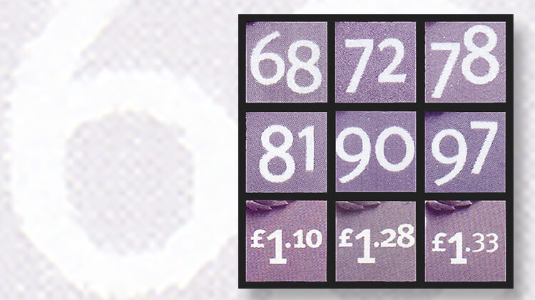
The Tudor rose design, on the English stamps issued for the second weight step for worldwide airmail letters, has digits that bounce around like tennis balls.
The 68p stamp issued in 2002 has two digits of the same size but the 8 is lower than the 6. The 72p of 2006 has the 2 smaller than the 7 with the tops aligned.
Same-size digits return on the 78p of 2007, but the 8 is higher than the 7. The 81p, issued in 2008, and 90p, 2009, have the style of the 72p, and then the 97p of 2010 reverts to the 78p format.
The inconsistency continued as denominations exceeded £1. The denominations of £1.10, £1.28 and £1.33, issued in 2011, 2012 and 2015, respectively, are each noticeably different.
Initially, all the pictorial regionals had no borders, that is, the design extended to the edge of the stamp. However, the darker colors of some designs reduced the effectiveness of the vertical phosphor bands used by the automated mail-handling equipment.
In 2003, all of the regional stamps were issued with white borders and the designs slightly reduced in size to fit.
Another part of the design with frequent changes is the queen’s head. The first major change occurred to the Welsh stamps. When the borders were introduced, the queen’s head was changed from metallic silver to white, matching the value tablet.
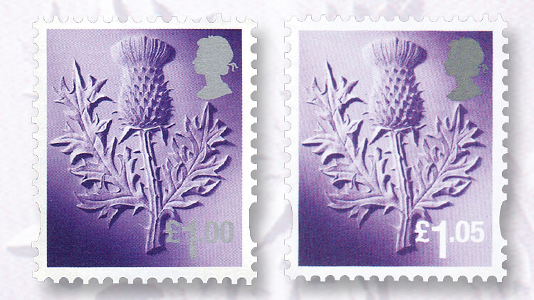
Recently, the silver heads on the English and Scottish stamps have been slowly, and inconsistently, changed to gray. This is probably a cost-saving move, since the black ink used to print gray is presumably less expensive than metallic silver.
The two nondenominated English stamps had the queen’s head changed to gray in 2012, but the Scottish stamps retained the silver for the head and value tablets until 2016.
The denominated stamps for letters to Europe for both England and Scotland were changed to the gray head with the £1.05 denomination issued in March 2016.
The value tablet of the Scottish stamp was also changed to white, matching the format of the English stamps. This is the only Scottish stamp to have this change so far.
The latest stamps with the fourth design, used for letters to the rest of the world, retain the metallic silver head, but they probably will be changed to gray at the next rate increase.
Stamp catalogs generally assign new numbers when there is an intentional and visible color change, but most catalogs have ignored the change on the nondenominated stamps and not mentioned it on denominated stamps that get new numbers because of the new denominations. Perhaps this is because the metallic silver and gray colors are similar. However, the difference is easy to spot. The silver is lighter than the gray and generally shiny, though sometimes the phosphor band printed over the colored inks dulls the shine.
Like their siblings, the Machin head stamps, Great Britain’s pictorial regionals appear at first glance to be unchanging. Closer study of these diverse stamps rewards the collector with the discovery of an interesting variety of changes.
MORE RELATED ARTICLES
Headlines
-
US Stamps
Oct 7, 2024, 3 PMMcMurtrie dismissed as APS education director following Sept. 21 arrest
-
US Stamps
Oct 7, 2024, 12 PMVasiliauskas named president of Mystic Stamp Co.
-
US Stamps
Oct 6, 2024, 5 PMApgar souvenir card available
-
US Stamps
Oct 6, 2024, 4 PMFirst Continental Congress and U.N. stamps receive Scott catalog numbers
